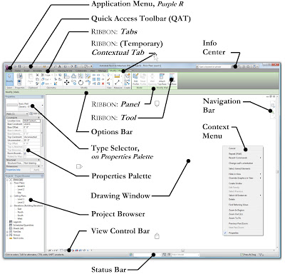
This first image is what the UI originally looked like and remained this way for about 9 years. Most of the tools were accessed from the Design Bar on the left. Clicking on the labels (drawers, I liked to call them) would shift things around and expose different groupings of tools. Notice the Type Selector was on the Options Bar (not on the Properties Palette - you will see why in a moment).
In 2009, the Revit 2010 UI introduced the Ribbon. Notice these first two images do not show the Properties Pallet; newer users to Revit might be surprised to know that that the instance properties dialog could not be left open. When it was open, you had to make your changes and close it, similar to how the Type Properties dialog works.
In 2010, Revit 2011 allowed the Properties Pallet to remain open while editing the model... that was a big deal!
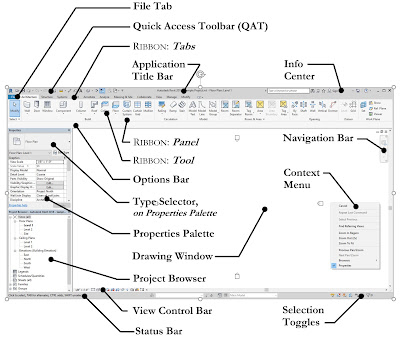
Fast forward to 2017, and the Revit 2018 gets another modest UI update which makes the overall application feel clean and modern in my opinion. Comparing the image below with the previous one you can see the difference.
Looking back over 17 years the UI has not changed too many times, and in the long run (despite some heated debates when the Ribbon was introduced - there were even t-shirts made with a Revit.ini hack to switch back to the old UI) I think they have all been positive.
In the near future I have a couple related posts on the interesting history of the Scale command and a similar retrospective of the Materials dialog! So stay tuned...


